


|
Visualization based Analysis of Quality for Large scale Software Systems Guillaume Langelier, Houari A. Sahraoui, Pierre Poulin In Proceedings of Automated Software Engineering (ASE 2005) Additional material and figures in color |


Figure 1: Three class representations: All three metrics (CBO, LCOM5, and WMC) are increasing in value from left to right. Note: most figures in this paper should be viewed in color to better understand their perceptual values.
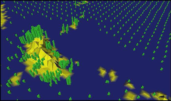
Figure 2: GIS representation: Typhoon conditions across Southeast Asia during Summer 1997 [9].
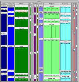
Figure 3: Original 2D Treemap representation of census data.
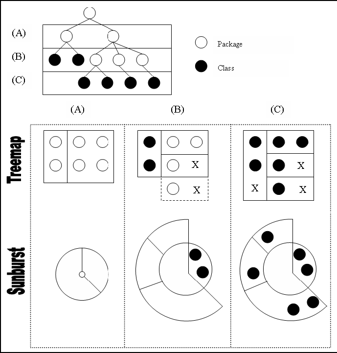
Figure 4: Illustration of converting a software hierarchy in our adapted Treemap and Sunburst techniques.
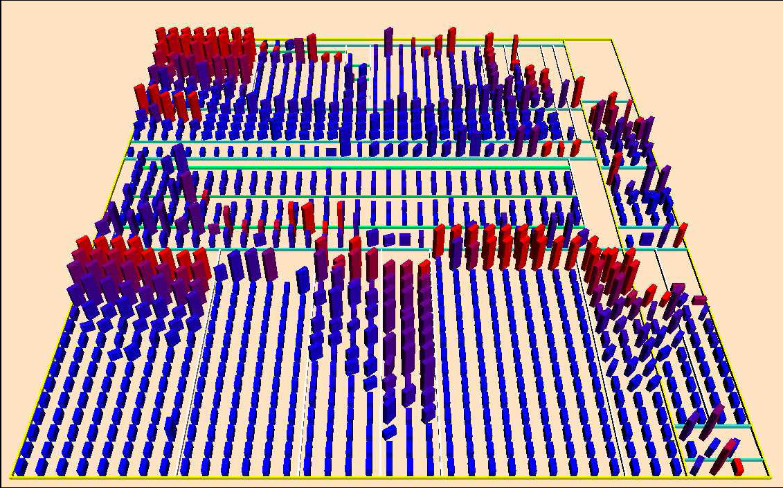
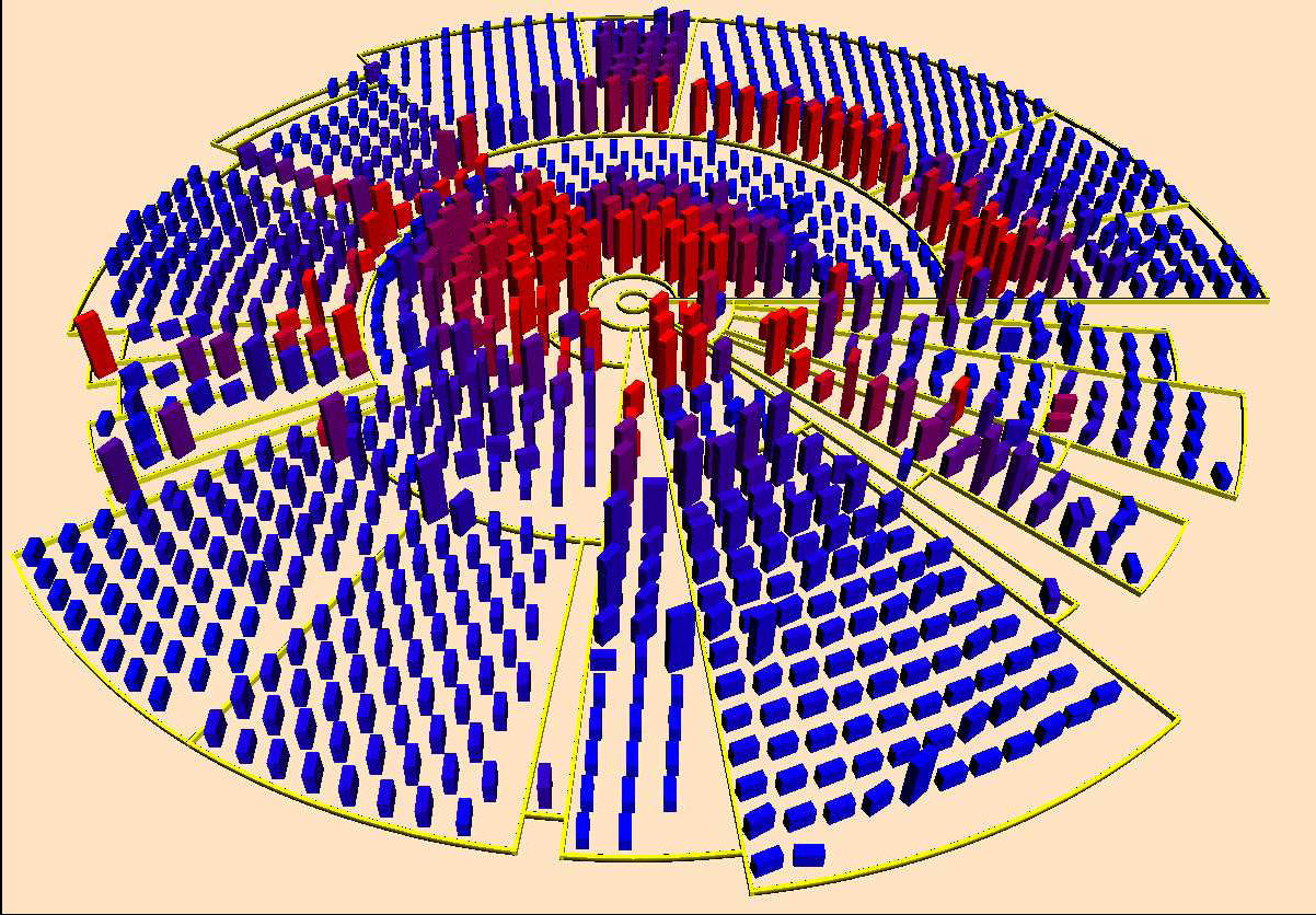
Figure 5: (Top) Modified Treemap technique and (bottom) modified Sunburst technique as displayed in our framework. They both represent PCGEN, a tool for character generation in RPG (1129 classes).
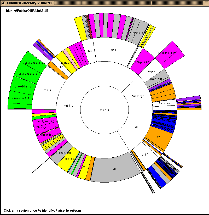
Figure 6: Original 2D Sunburst representation of a file system.
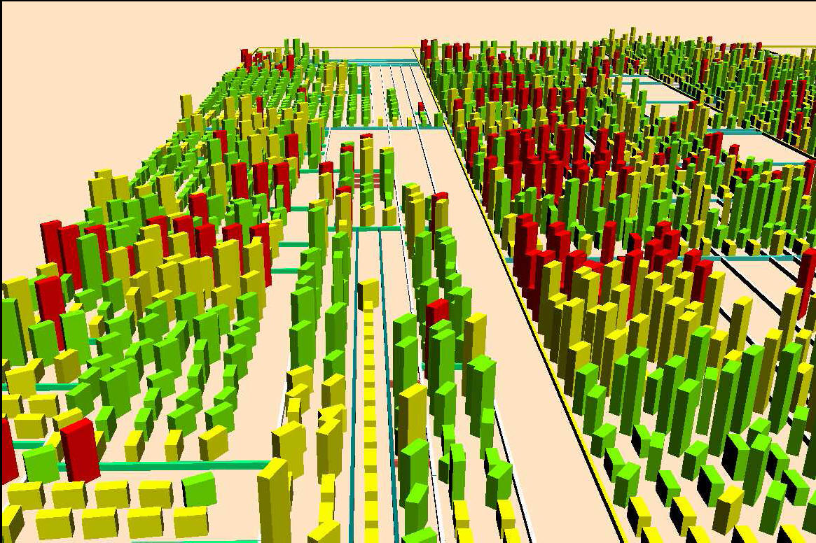
Figure 7: Extreme values for CBO are presented in red. It displays a part of JRE 1.4.04 from Sun Microsystems.
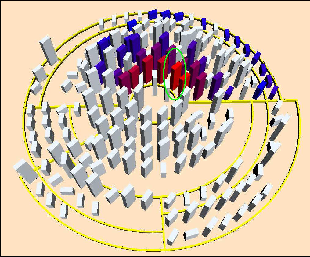
Figure 8: An example of the association filter: Only classes associated with the class circled in green remained in color.
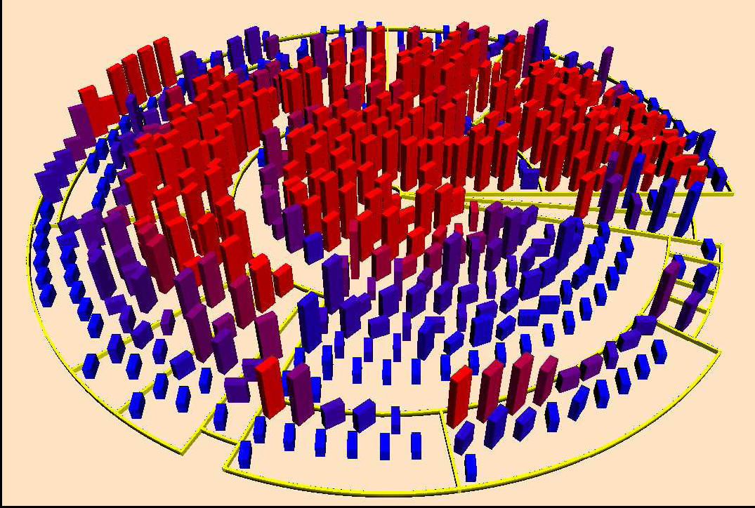
Figure 9: The predominantly red appearance indicates that the coupling in this program seems to have grown out of proportion. Maybe all this coupling is not essential. It represents ArtOfIllusion, a full featured 3D modeling, rendering, and animation studio (523 classes).
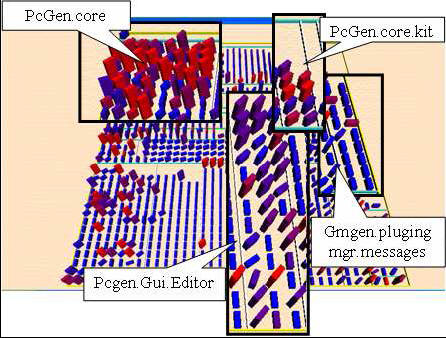
Figure 10: An example of the correspondence between visual patterns and package types.

Figure 11: Representation of the evolution, from left to right, of a package over 23 versions. It represents Quantum, a database access plugin for Eclipse (689 classes).
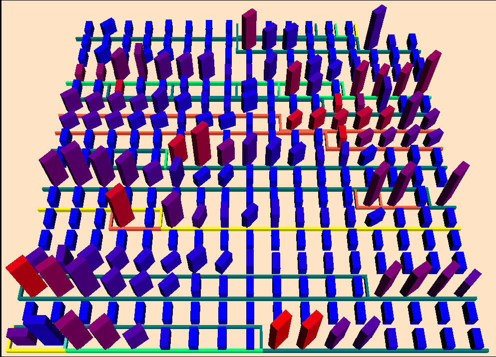
Figure 12: Example of the Treeline algorithm. It represents EMMA, a tool for measuring coverage of Java software (286 classes).